My Nimbo
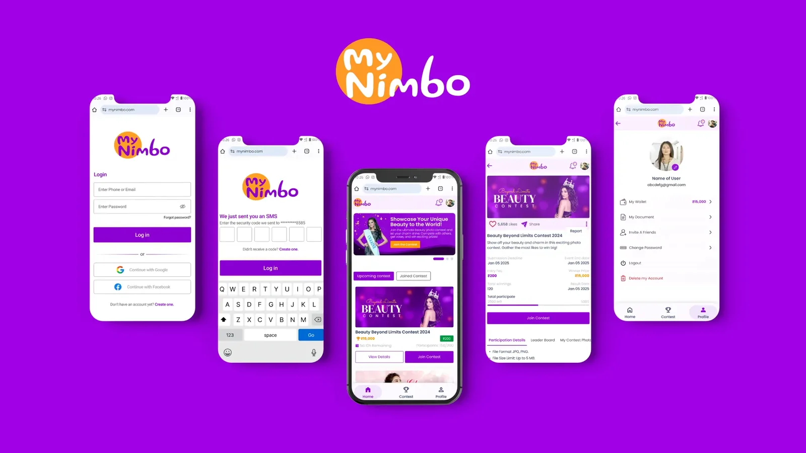
A photo contest app where people pay a small entry from their wallet, get votes, and win a share of the prize pool. I designed the app and the admin dashboard behind it.
The problem
People love showing off a cute baby photo, a pet or a makeover. But there was no simple place to enter a contest, get fair votes and win real money for it.
The client wanted a gamified contest space that anyone could join from their phone, and that a small team could run without a developer for every change.
Easy to create
Anyone should be able to start a contest in a few steps, without reading instructions.
Fair to win
Rankings and the prize split must be visible, so nobody feels the result was fixed.
Real rewards
Entry and winnings go through a wallet with real money, so trust matters on every screen.
User flow
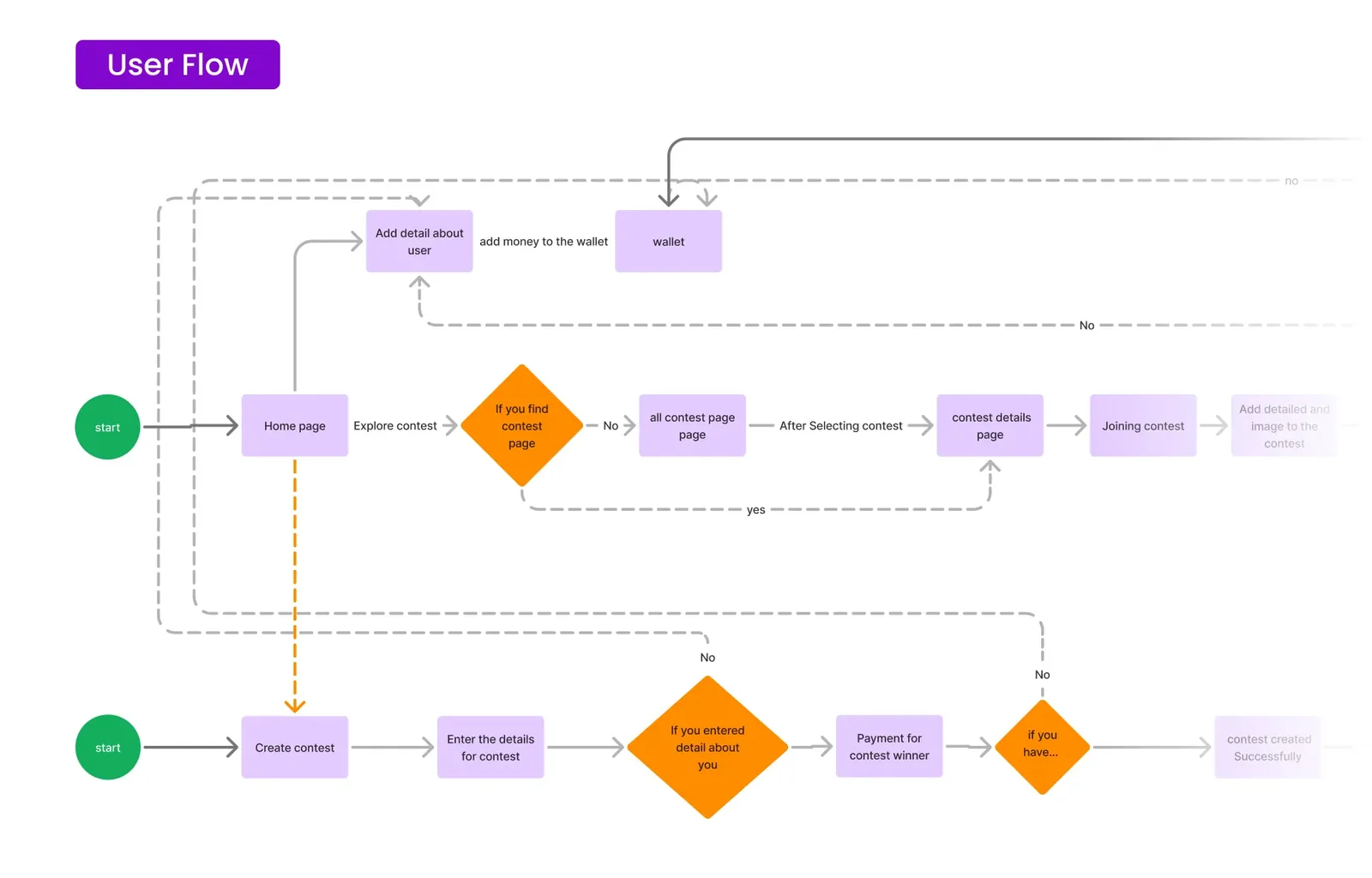
Two paths start from the home page: join a contest, or create one. Both meet at the wallet, because nothing happens without money in it.
Key decisions
What I chose and why.
Contest creation in 4 short steps
Info, Timeline, Prize, Payment. One decision per screen, with a progress bar, so a first-time creator never faces a long form.
Trade-offMore taps than one long page, but far fewer people give up halfway.
Live preview of the prize split
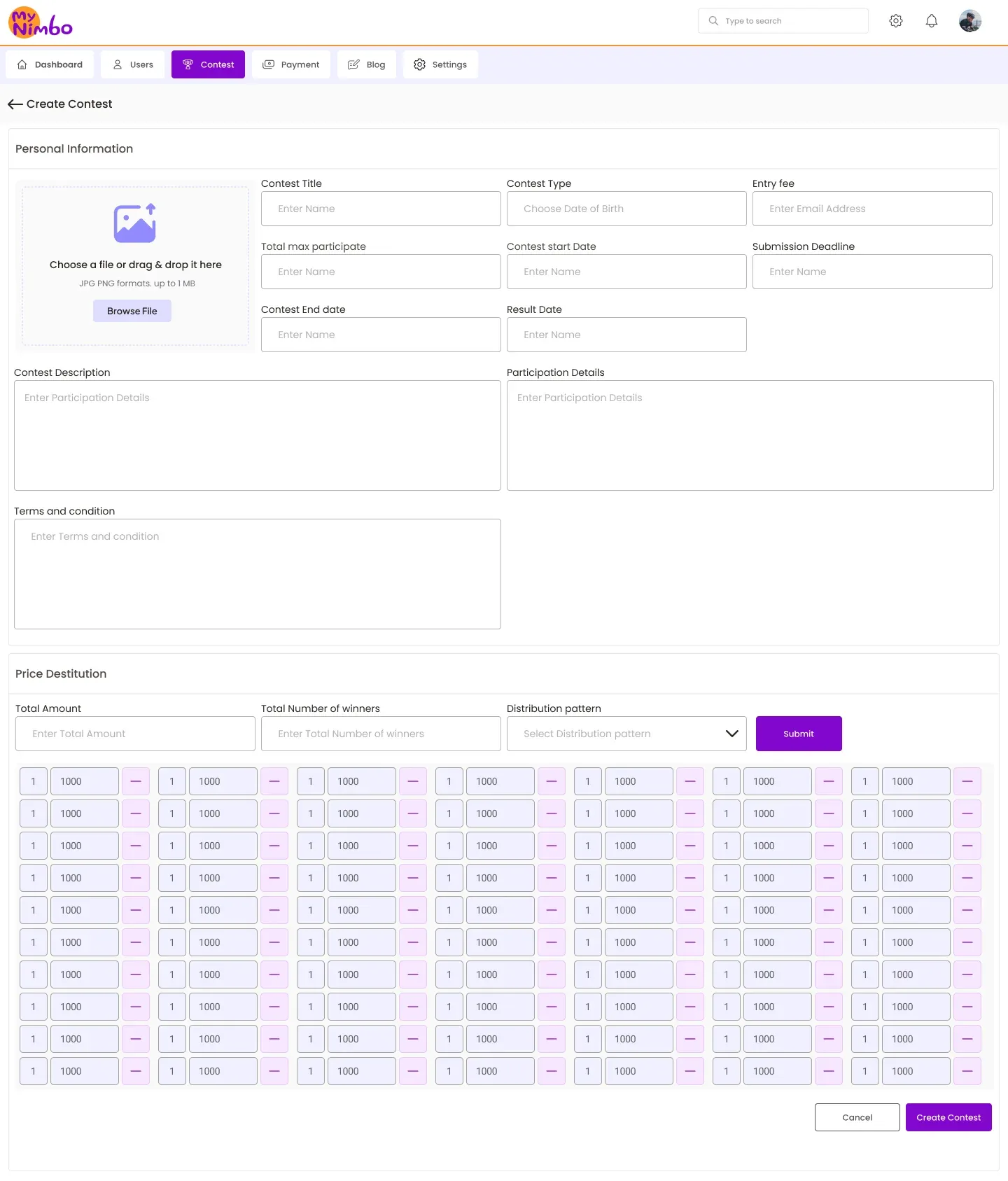
As the creator sets the pool and the split, they see exactly what 1st, 2nd and 3rd will get. Money rules are easier to trust when you can see the numbers change.
Trade-offA more complex screen to design and build.
Grouped winners
Besides fixed places, a creator can say "ranks 3 to 5 share 20%". This keeps more people in the game for longer without making the setup harder.
Trade-offThe rule needs a clear explanation on the contest page.
A wallet, not pay per entry
Users add money once and enter many contests. It removes a payment screen from every entry and puts all transactions in one place they can check.
Trade-offThe wallet screens carry a lot of trust, so they got the most care.
One admin dashboard for everything
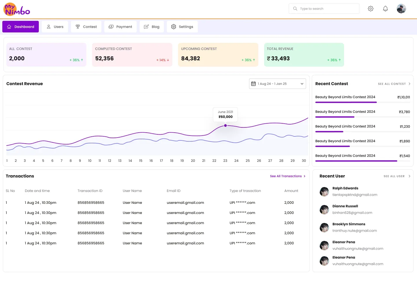
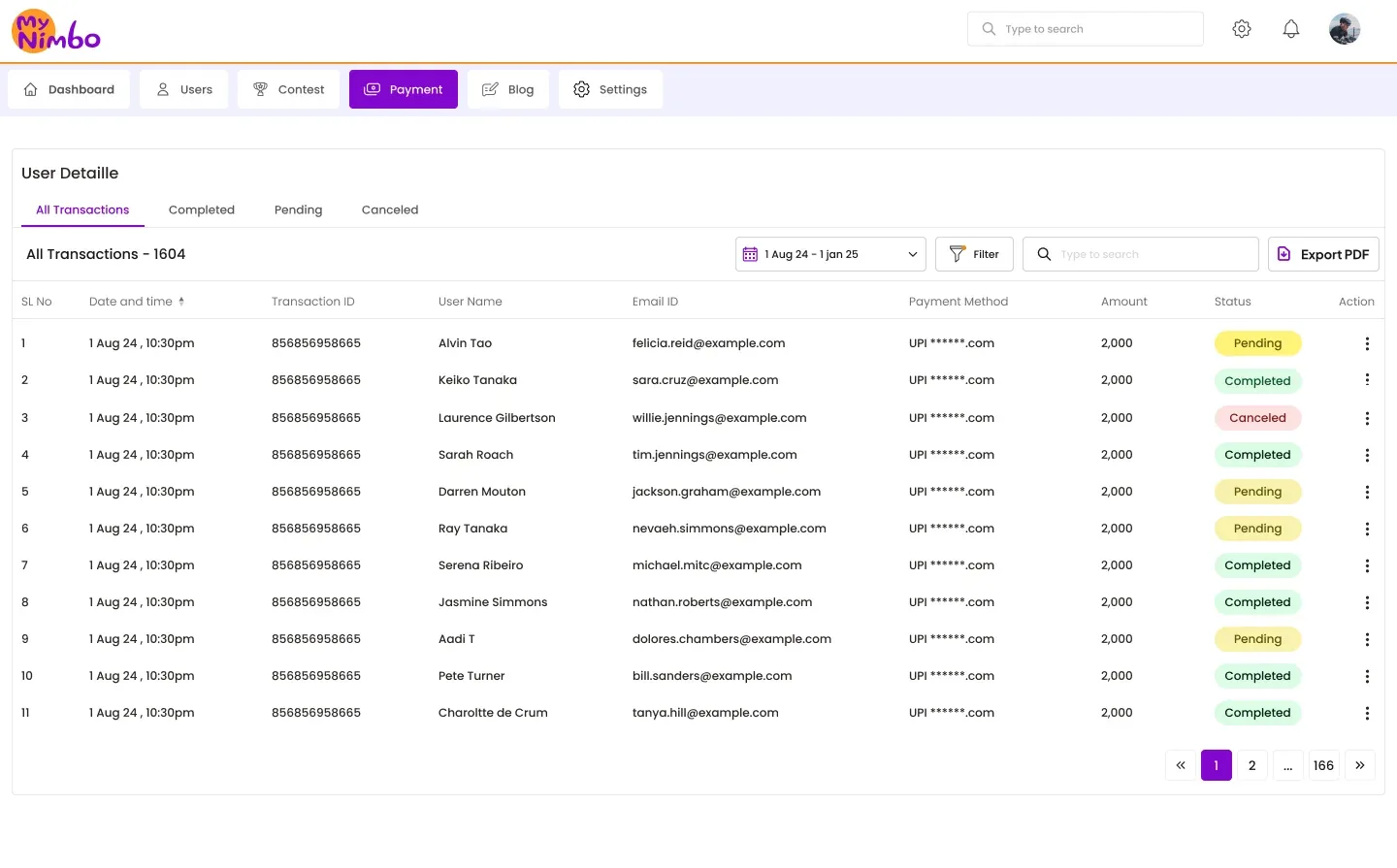
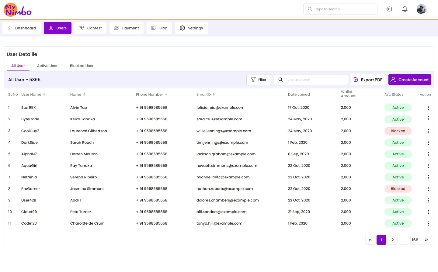
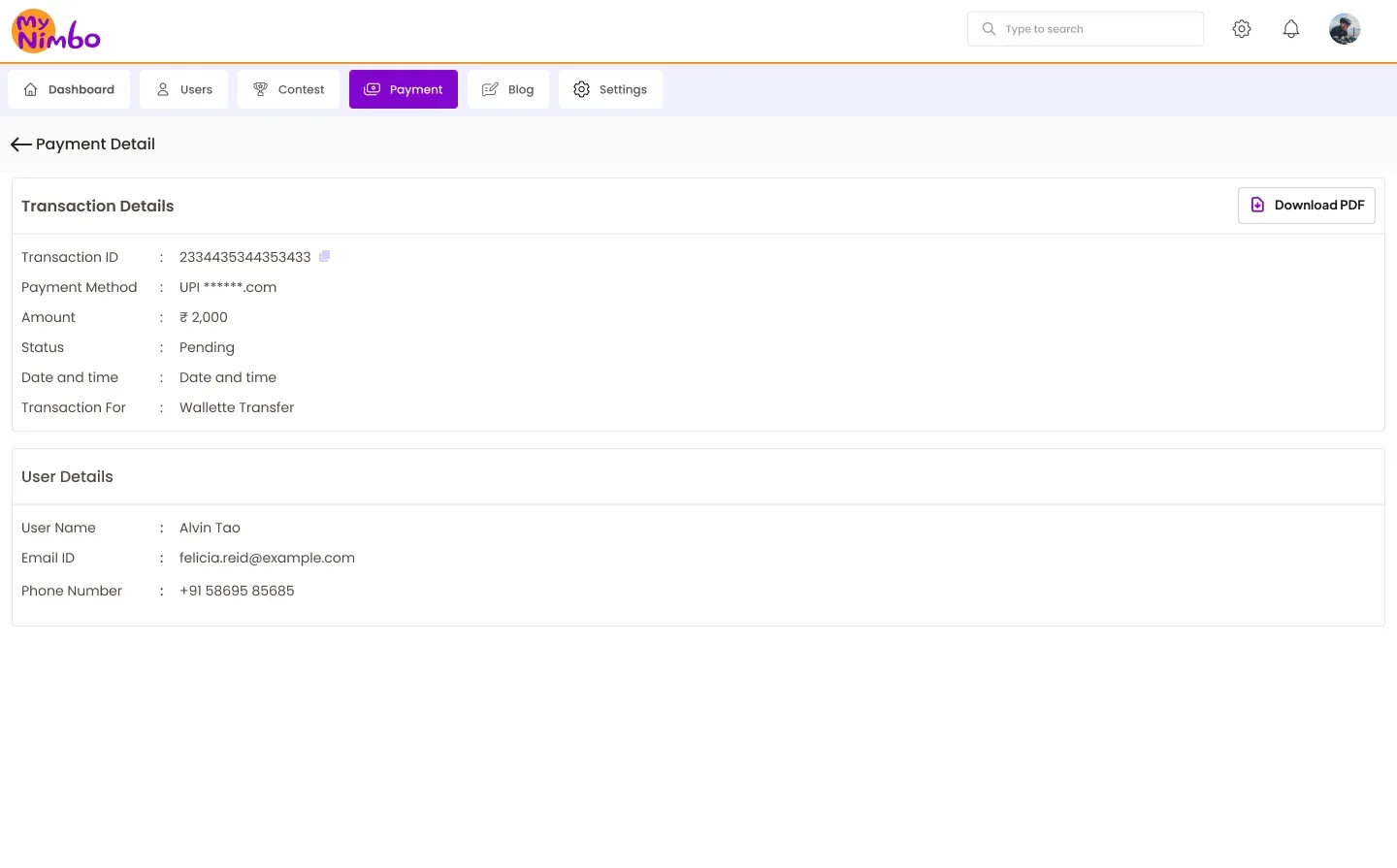
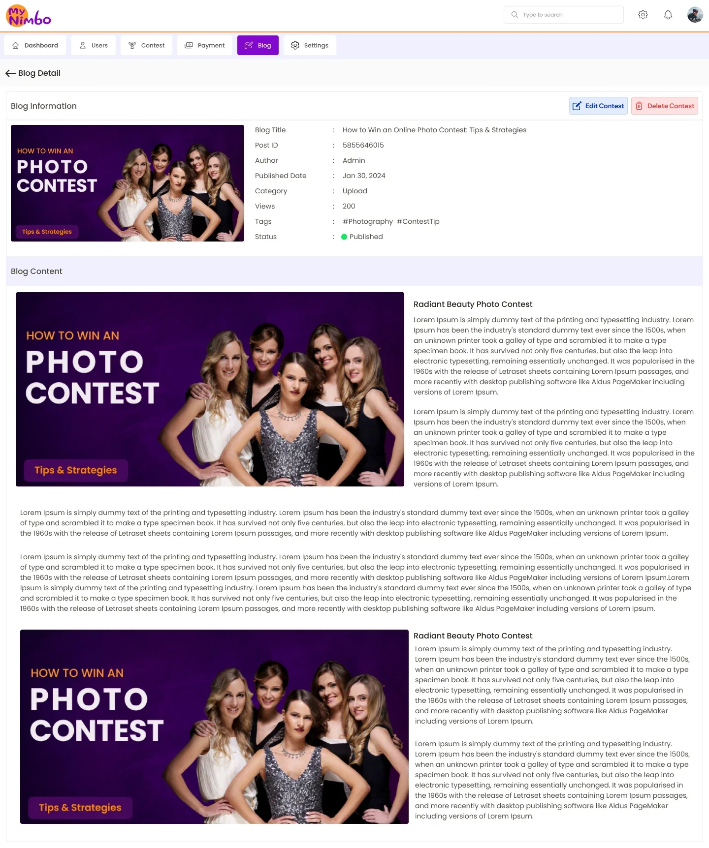
Contests, users, payments, blogs and support tickets all live in one dashboard, so the client's small team can run the platform day to day.
Trade-offDense tables, which meant careful work on filters and status labels.
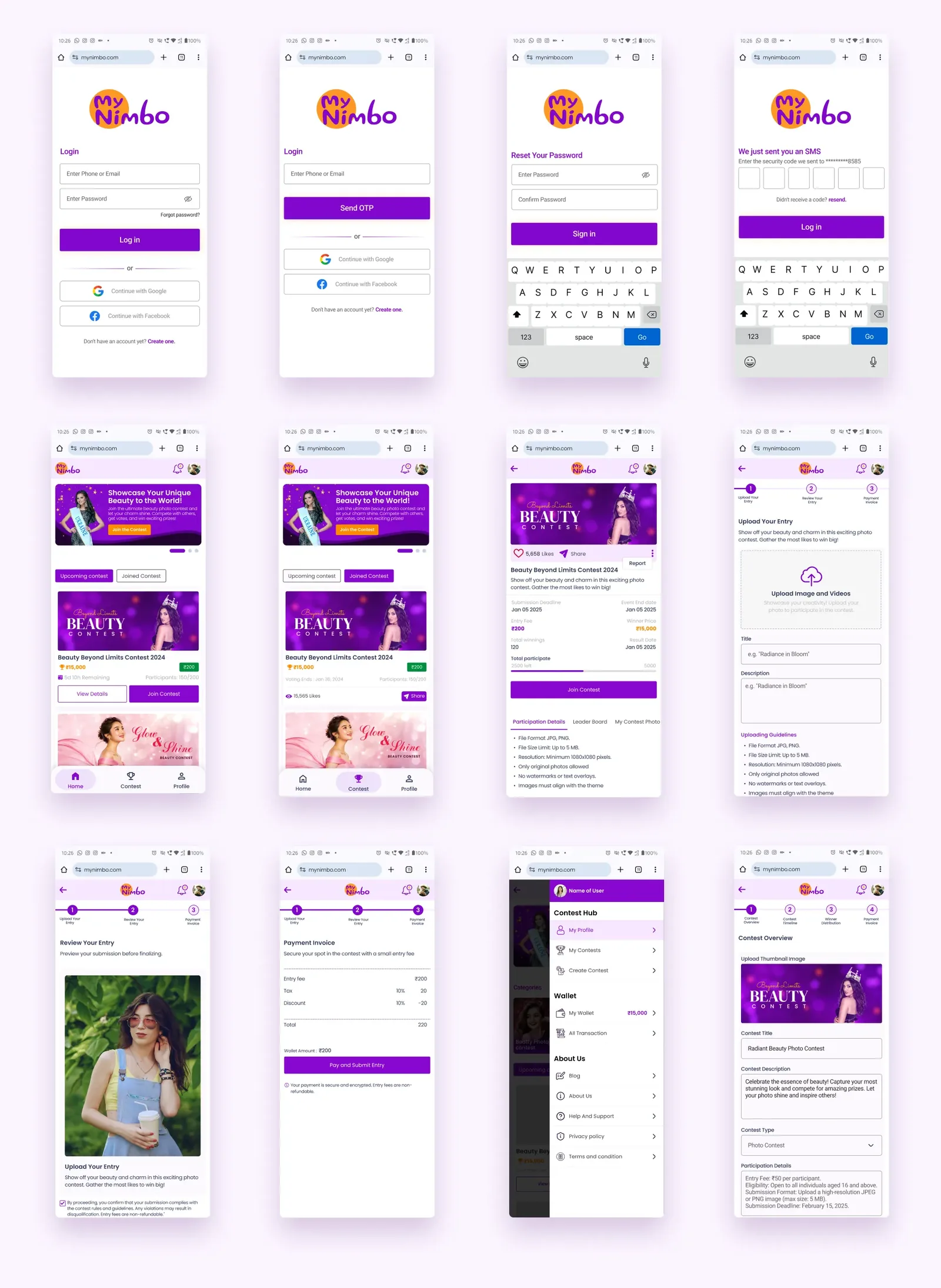
App screens
Onboarding, contest list, contest details, joining, the leaderboard and the wallet.
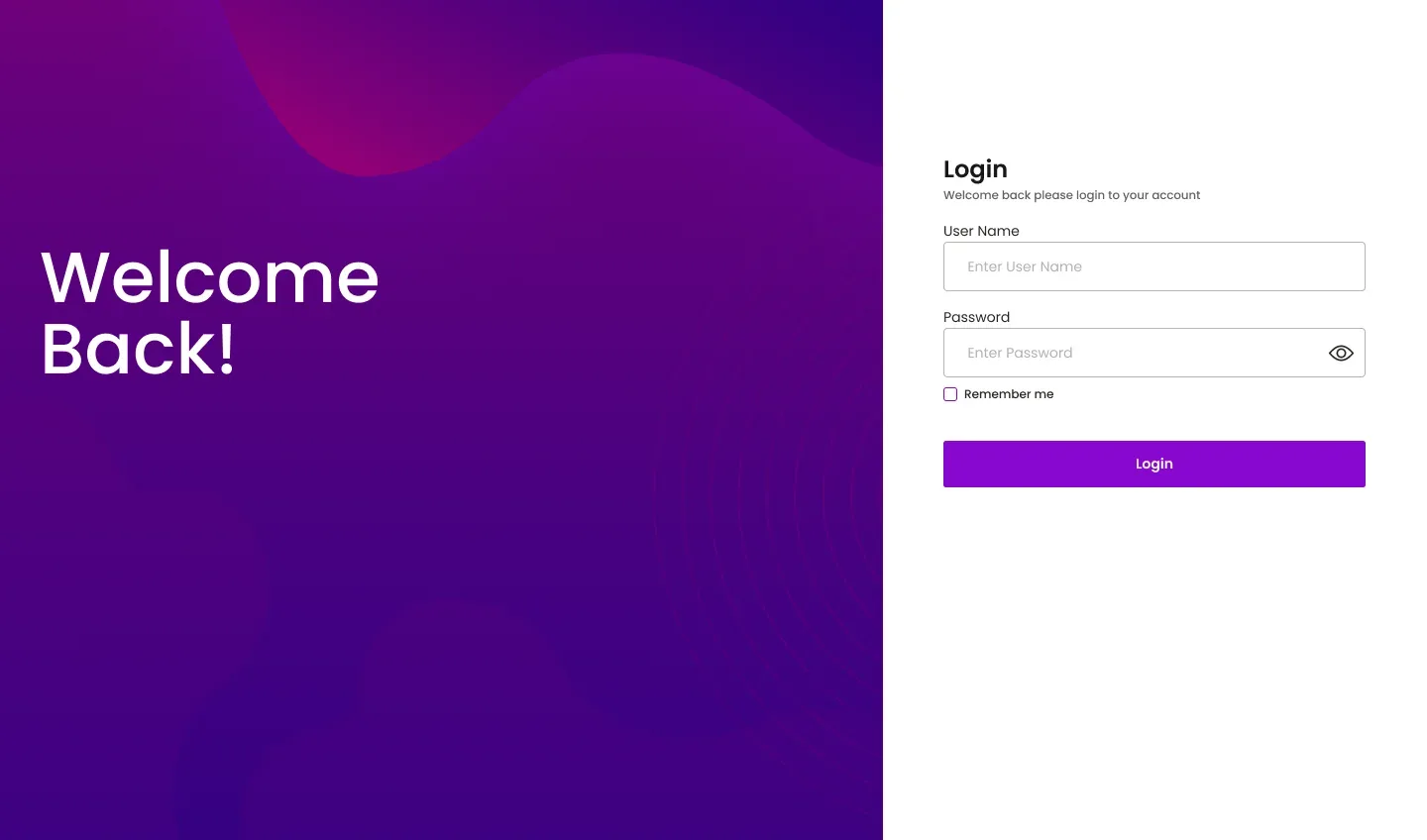
Admin dashboard
The side the client's team uses every day: revenue at a glance, transactions, contests, users and content.
Brand
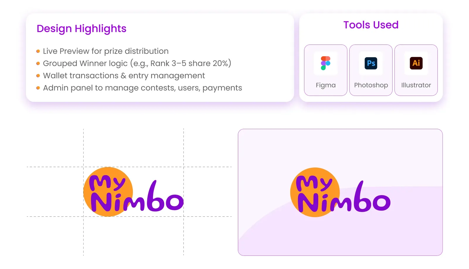
I also drew the logo: a playful hand-lettered wordmark on an orange circle, with purple as the main app colour. It had to feel fun, since the product is a game, while the wallet screens around it still look serious.
Looking back
The hard part wasn't the screens. It was making money rules feel simple and fair to someone who has never run a contest.
- Showing the prize split live while it's being set
- One wallet for every entry and win
- A short, stepped creation flow
- Lean less on purple across the whole app
- Test the grouped-winner rule with real users before building it
- Plan empty states for a brand-new platform with few contests