Design System Starter
A Figma plugin that builds a full design system for you: colour tokens, text styles, spacing, light and dark variables and ready components. You answer 11 short steps; it builds everything at the end.
The problem
Every new product needs the same foundation: colours, type, spacing and buttons. Setting it up by hand in Figma takes days and is easy to get wrong.
Small teams and freelancers skip it, then pay for it later when every screen uses slightly different values.
Slow to set up
Hundreds of variables and styles, made one by one.
Easy to break
Colours that fail contrast, or text styles that don't match the spacing.
Hard to hand off
Developers need the same tokens as CSS or JSON, not a screenshot.
What I built
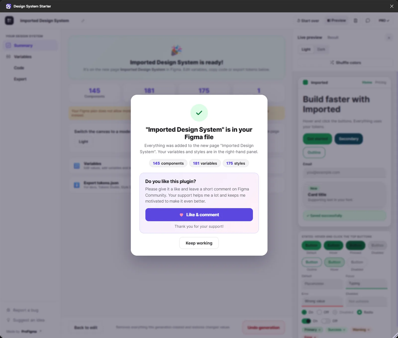
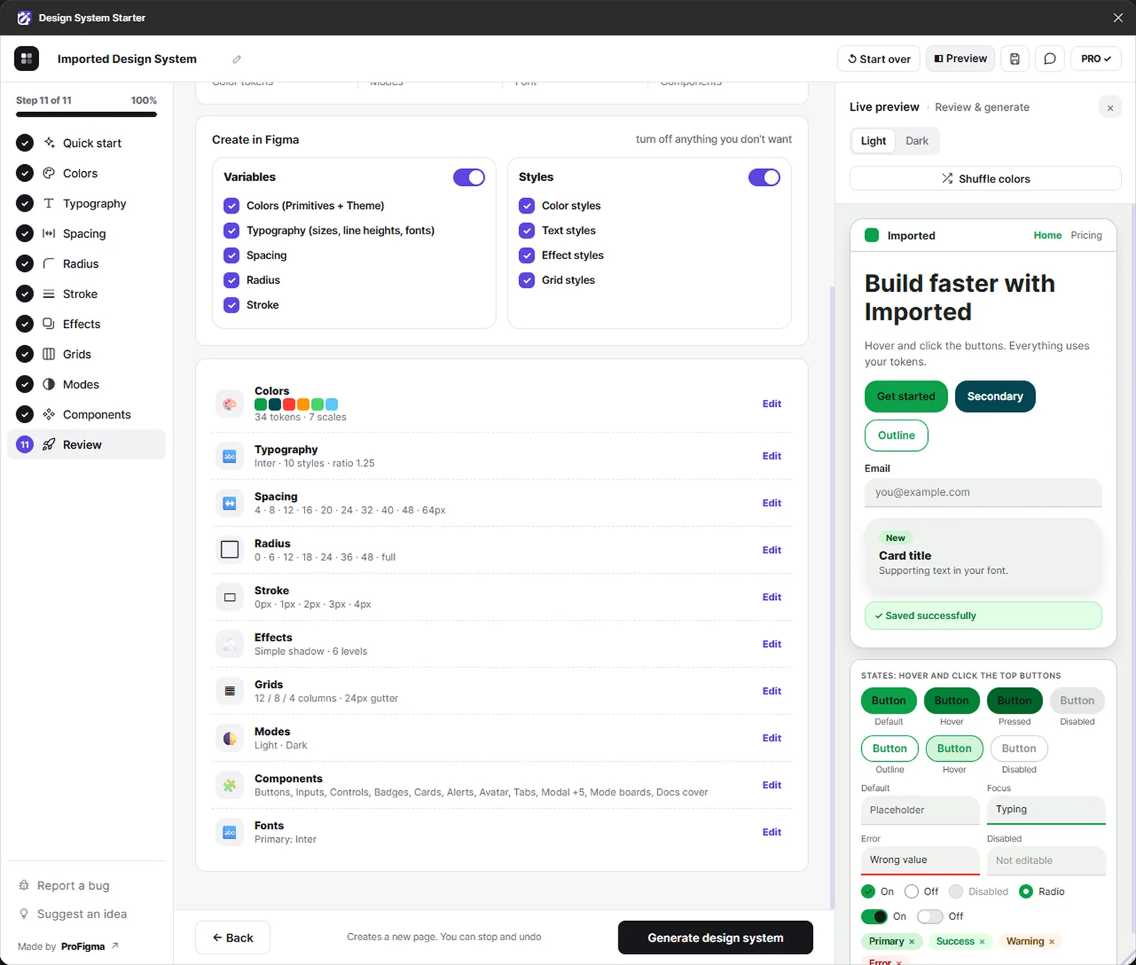
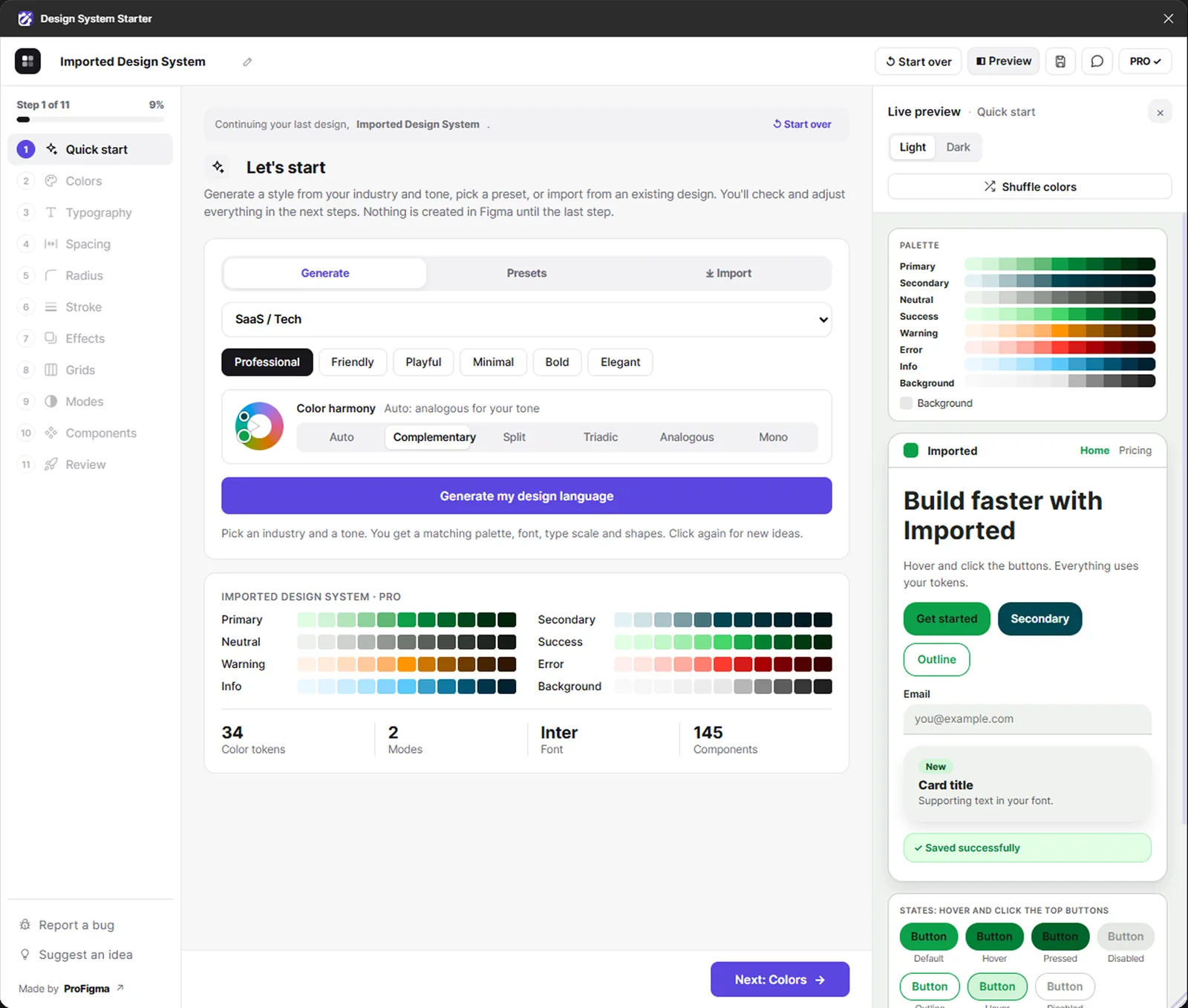
An 11-step wizard: Start, Colors, Type, Spacing, Radius, Stroke, Effects, Grids, Modes, Components, Review. Nothing is created until the last step.
OKLCH shades
Even, smooth shade scales from one brand colour, plus semantic tokens.
Contrast warnings
WCAG problems show right next to the token, before you build.
Light and dark
One switch changes colours and sizes across the whole system.
145 component variants
15 component types, all bound to the tokens.
6 presets
Material, iOS, Fluent, Tailwind, Minimal and Bold.
Stop and Undo
Stop a build halfway, or undo the whole thing afterwards.
Export tokens
tokens.json, CSS and Tailwind for developers.
Bring your own
Import tokens.json, including Tokens Studio files.
Key decisions
What I chose, why, and what it cost.
Build nothing until the last step
People try things. A wizard that only builds at Review, with Stop and Undo, means nobody gets a messy file from experimenting.
CostYou only see the real Figma result at the end, so the live preview had to be good.
Every component value comes from a token
Padding, radius, colour and text in every component snap to the nearest token. Change a token and the components follow.
CostMuch more work than drawing components with fixed values.
Contrast checks beside each colour
Accessibility problems are shown where you pick the colour, not after the system is built.
CostSome brand colours need adjusting, which not every client likes.
Free and Pro in one plugin
The first Pro version was rejected in Figma's review. I merged it into the approved free plugin and unlock Pro with a Gumroad licence key.
CostLicence checks inside the plugin, and two tiers to explain.
Presets for a quick start
Six presets based on well-known systems give a good first result in seconds, then you change what you need.
CostPeople may stop at the preset and not make it their own.
What was messy
It didn't go in a straight line.
My first Pro version was rejected by Figma's review. Then the first test in real Figma showed bugs the browser preview never had.
- Figma review rejection, then rebuilding as one free plugin with a Pro key
- Auto-layout frames stuck at a fixed height after resizing
- Binding colour variables dropped the paint opacity
- Redesigning the interface several times until it felt simple
- Test inside real Figma from day one, not only in a browser mock
- Read the plugin review rules before building Pro
- Ship a smaller first version sooner
How AI fit in
Decided
- The 11 steps and what each one asks
- Presets, defaults and token names
- Free and Pro split and the price
- Every round of UI redesign
- Testing in real Figma files
Built
- Colour maths and shade scales
- Variables, styles and components
- Token import and export
- Undo and Stop for builds
- Licence checks with Gumroad
Where it is now
Free on Figma Community, with Pro unlocked by a licence key from Gumroad.
Next: add usage numbers here and more component types.